


Lose Yourself in the Wondrous Paintings of Jemima Moore
What keeps me curious and engaged when discovering new art is the feeling of losing myself in a painting. Naturally I’m interested in works that hold my attention, works that invite my eyes to explore their corners and layers. I’m especially intrigued by that peculiar feeling of being captivated by a piece. There’s no science to it, as far as I can see, but it’s a thrill that’s wonderfully addictive.
All of which is to say: my attention was recently held by Jemima Moore’s work.
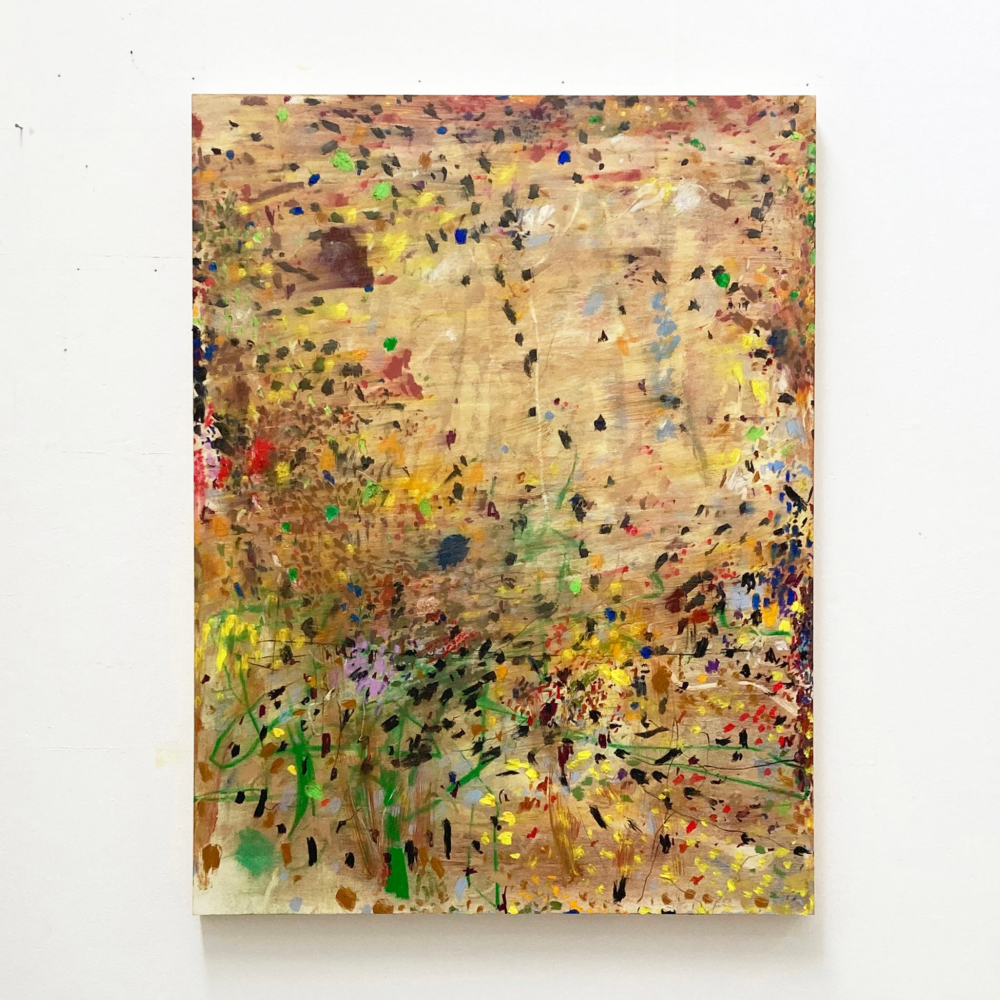
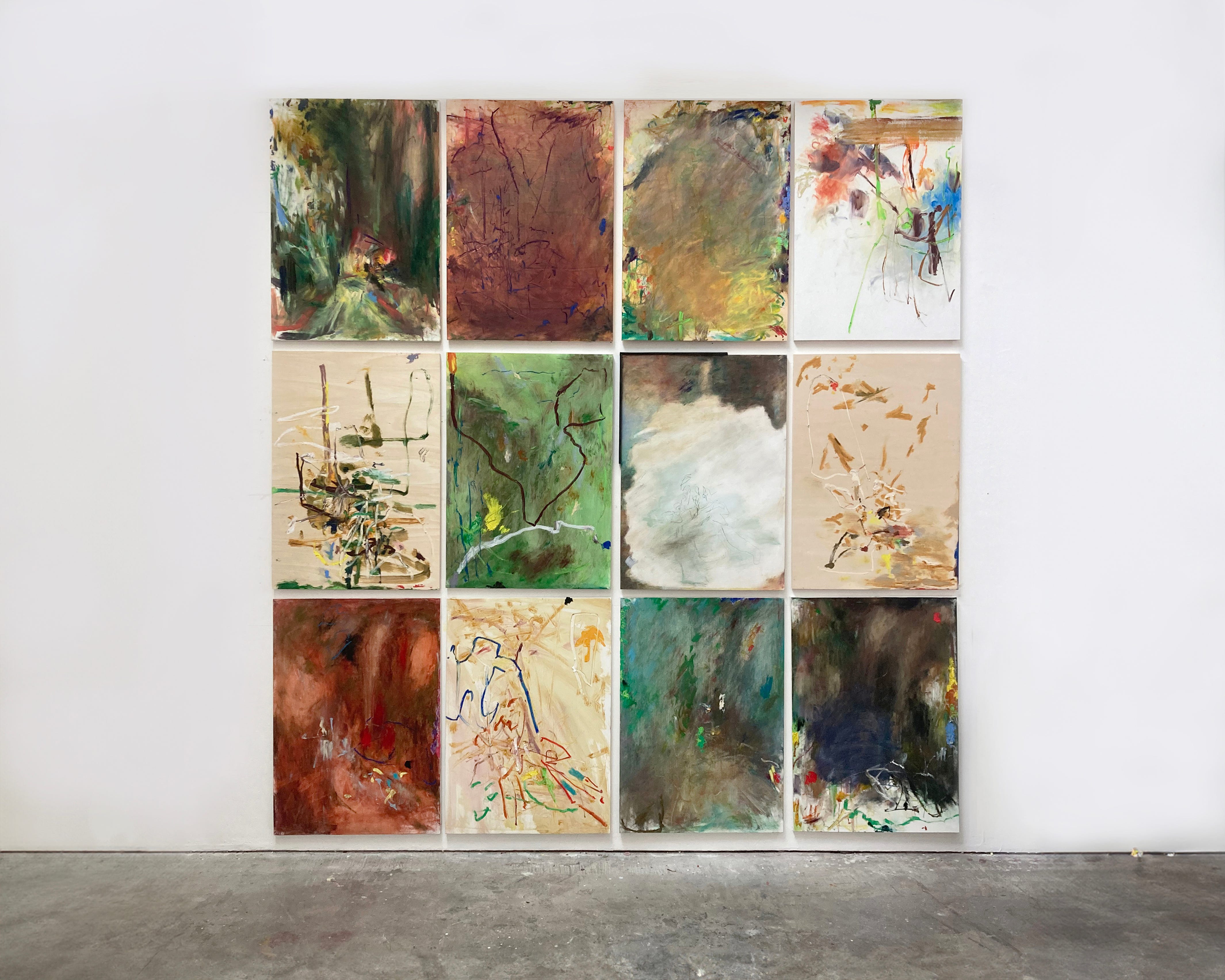
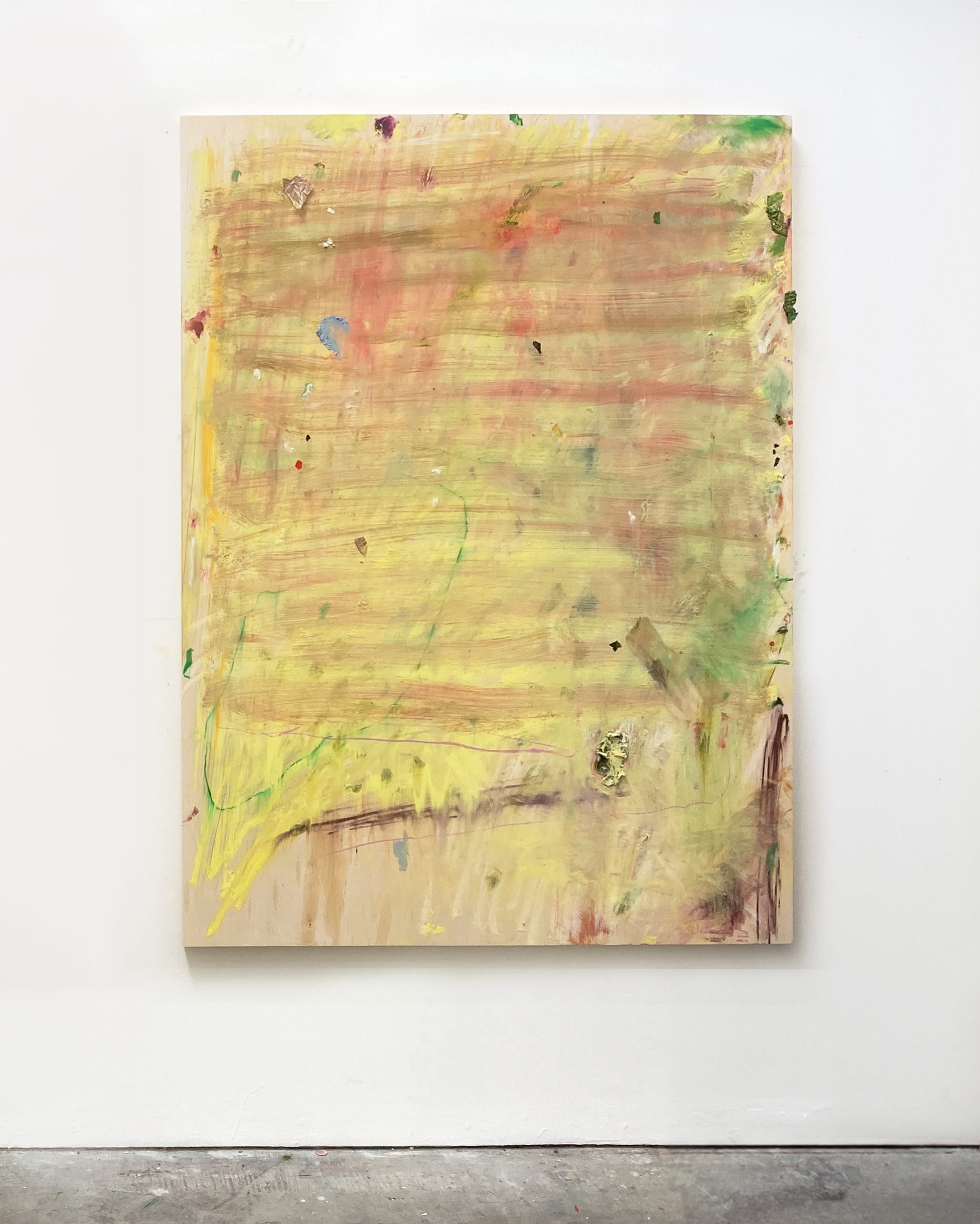
The London-based artist makes abstract paintings that are beautifully expressive, with little dabs and dizzying details, each work its own galaxy of marks. She sometimes nods to nature with organic forms, and yet her colour palette isn’t always natural-looking.
When I look at Jemima’s work, my eye wanders, flicking between sweeping gestures and subtle colour shifts, taking in the layers of paint. Her pieces are sort of wondrous and magical, in a way that’s hard to give language to. But again, it’s that beguiling quality that keeps me coming back and noticing different things each time.
I was hoping Jemima could shed a little light on how she creates this magic, so I reached out to her on Instagram following her MA degree show at the RCA in London this past June.
Hey Jemima. Firstly, congrats on your MA degree show. How do you feel about the work you showed?
I think it’s probably a bit soon to know how I really feel about my pieces, but in general it was a very positive experience.
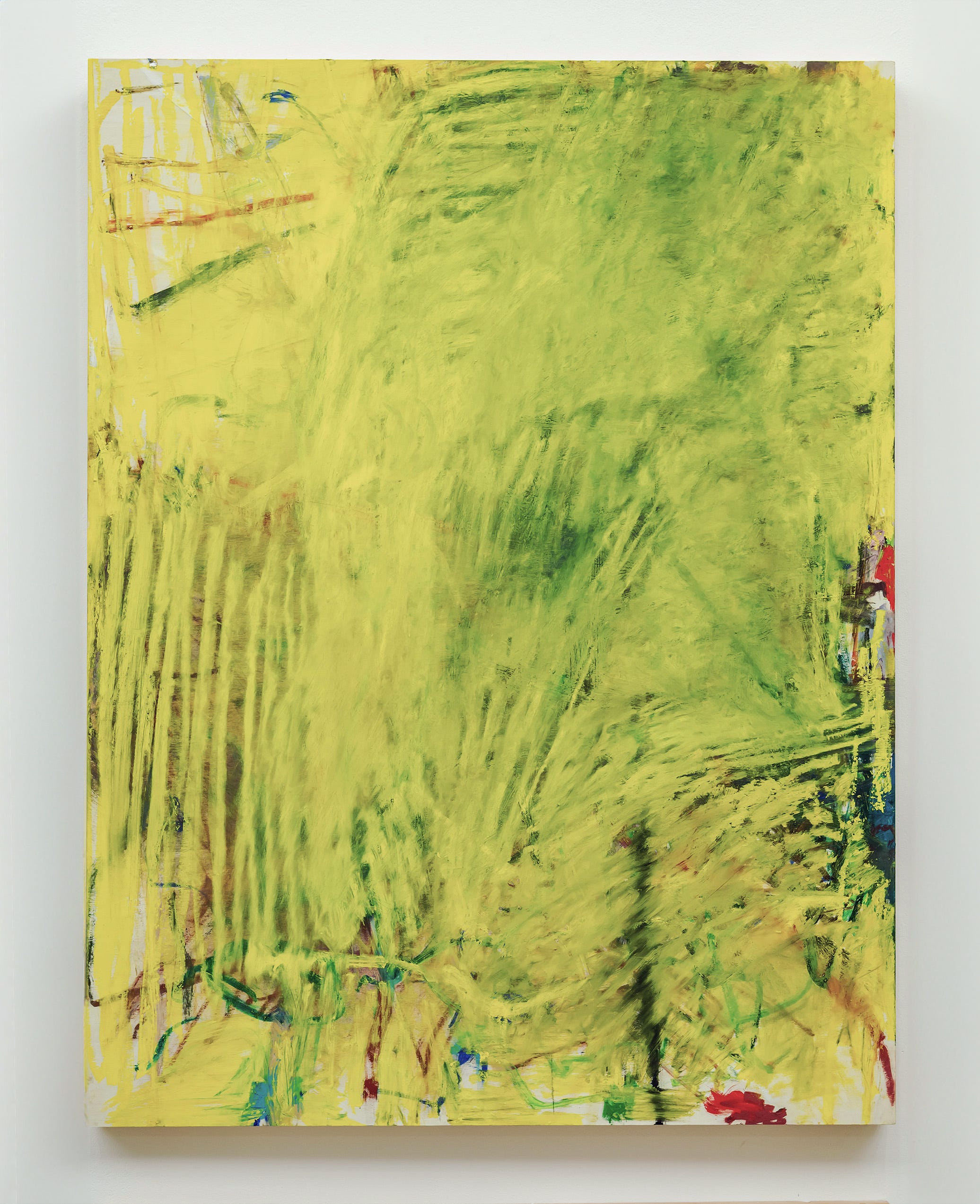
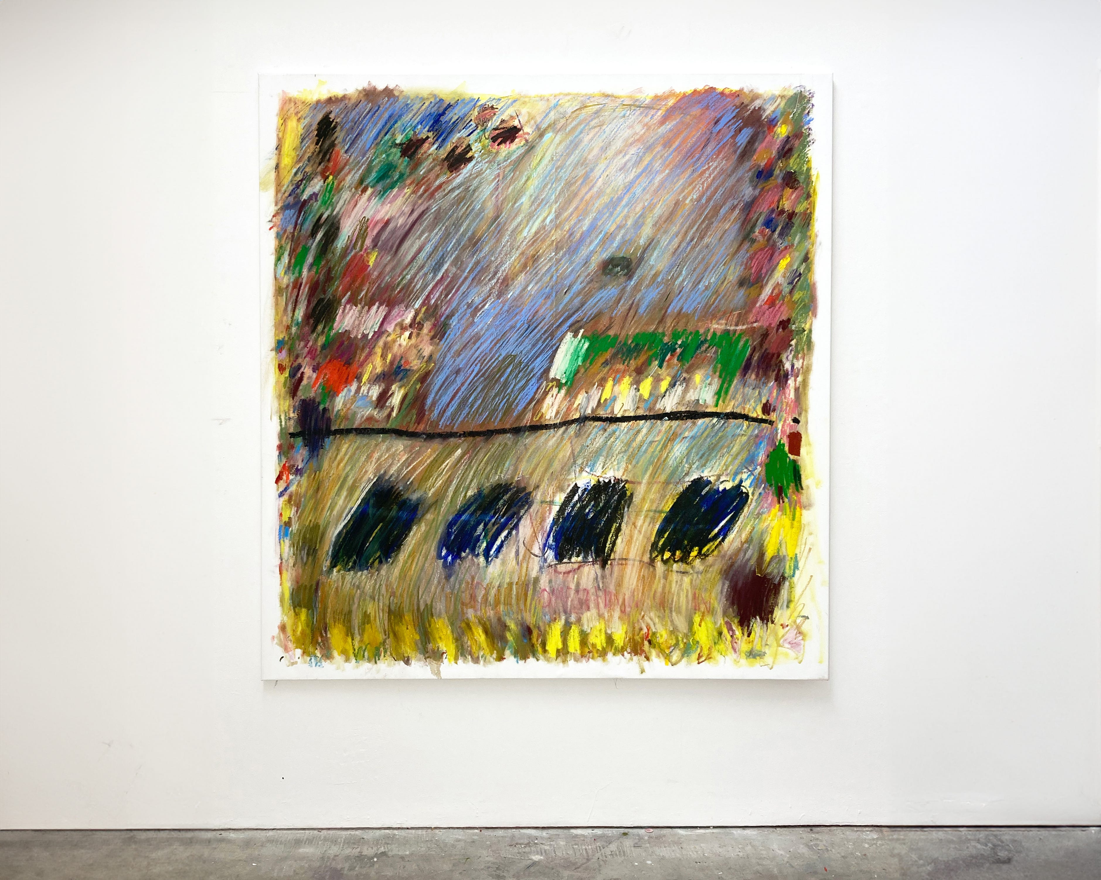
I’m curious how you make a piece. Could you walk me through your process, specifically when making “Smothered in a High-Vis Hug / Loose Nuts on the A3”? There’s an intriguing blurry effect, with lots of partially hidden details.
I think that piece was the first one I had made using oil stick on that size of panel, so I was trying to figure out how to make a painting on that scale and with those materials. It actually started out as an all-over, loads of colours, abstract expressionist-style painting that I made in response to a Watteau painting of a Harlequin.
I found it all too much on that scale so I thought I’d smother it in high-vis yellow. The different levels of blur come from rubbing it into the oil stick underneath at varying pressures.
I love your titles, particularly when you inject a bit of humour in there. How do you think about them in relation to the work, and is humour important?
I tend to think of titles after the work is done and I like to pick something that is close to the first thing that comes into my head. I allow the materials to guide the painting process, so it's only after a work is complete that I realise it is maybe connected to a memory or something I have seen. Some of the titles are funny and some are not, but I think a bit of humour is nice sometimes to deflate the incredible seriousness of painting, or rather, to allow a humorousness within the seriousness of painting.
I read you were thinking about the relationship between painting and the natural ecology of a field. How are the two similar?
I’m interested in circular economics and sustainable farming and I love the way that natural ecosystems can sustain themselves without the imposition of people and without the need for constant growth.
I try to think about painting in those terms, I try my best to respond to the material and allow the marks and colours to become their own ecosystem without getting too much of my own ego in the way, allowing them to self-generate. But that’s easier said than done.
Do you also think about your colours in relation to nature?
A lot of the colours I use are really vivid and man-made feeling like the lemon yellow I use. I live in London and have spent most of the last ten years staring at a screen and surrounded by a built environment, so I think most of the visual input into my head is man-made rather than natural. I think that’s probably why there’s a bit of a lurid luminescence to some of the works.
I noticed you’re using oil stick on panel a lot; are you looking for that resistance to help you make certain marks? What do you love about it?
I really hate oil paint! And I really hate turps! I make paintings through colour and mark so using oil pastels/sticks I get a very true mark thanks to the smoothness and resistance of the panel. I also get the most intense colour as they have such a high pigment content.
Lastly, any shout-outs you want to make?
I guess to the weird and wonderful cohort at the RCA this year, who are as obsessed with painting as I am, and made this year a joy!
Follow Jemima on Instagram: @jemima_moore_
Things on Our Radar This Week
A group show of painters, featuring Daniel Pettitt and Chris Martin, opens this Friday in Brighton (wish we could be there!)
Andrew Graves and Jonathan McCree have a great show at Haricot Gallery (till 17 Aug)

Plaster Mag asks if making art is one big holiday (choice quote: “An artist shouldn’t be sitting in a studio all day like an accountant”)
James Kalm did a video tour of a Christopher Wool mini retrospective in this ramshackle NYC space
A solo show by Spanish artist Enrique Brinkmann at Gallery Rosenfeld
Thanks for reading, see you next time!
Oliver & Kezia xxPalette Talk is free and we hope to grow with your support. If you’ve enjoyed reading, drop us a donation via PayPal…